Refs
Mathematica 覚書
Mathematicaにおけるプログラムの高速化手法
basics
Ctrl + Q で終了SHIFT + ENTER で実行
Directory[] : = pwd
花文字のI Esc scI Esc
ラグラジアン Esc scL Esc
チルダ Ctrl &, then ~ to enter directly
下付きと上付き両方: 下付きを入力後に %
関数のオプションを知りたい。例えば Integrate の optionを知りたいとき
Options[Integrate]
丸めたり四捨五入するとき
Round[] : 四捨五入
Floor[] : くりさげ
Ceiling[] : くりあげ
例
Round[2.7]=3
Round[-2.7]=-3
Floor[2.7]=2
Floor[-2.7]=-3
Ceiling[2.7]=3
Ceiling[-2.7]=-2
Show
LogPlot をいくつかしたあとに Show でグラフを重ねるとする。そのとき
PlotRange ->{All, {10^(-10), 10^(-5) }}
とすると表示がおかしい。次のようにすればよい。
PlotRange ->{All, {Log[10^(-10)], Log[10^(-5)] }}
データ読み込み
"hoge.dat" に次のように書かれていたとする。#mDM[GeV] coupling xsec omegah2 c1 c2 100 0.1 100 0.120 0 0 200 0.2 101 0.121 0 0 300 0.3 102 0.121 0 0 400 0.4 103 0.122 0 0 500 0.5 104 0.122 0 0これを読み込むには
Import["hoge.dat","Table"]とすればよい。読み込みに使うmathematica file と同じディレクトリに dat ファイルを置いている場合、
SetDirectory[NotebookDirectory[]]
data=Import["hoge.dat","Table"];
とすればよい。
違うところにある場合はフルパス書けば間違いない。例えば、
data=Import["/Users/abetomo/work/hoge.dat","Table"];
これで data には
{{#mDM[GeV], coupling, xsec, omegah2, c1, c2},
{100, 0.1, 100, 0.120, 0, 0},
{200, 0.2, 101, 0.121, 0, 0},
{300, 0.3, 102, 0.121, 0, 0},
{400, 0.4, 103, 0.122, 0, 0},
{500, 0.5, 104, 0.122, 0, 0}}
と入る。しかし、1行目は、この後色々やる際に邪魔である。次のようにして消しておく。
data=Delete[data,1]
6つパラメータがあるが、2次元プロットするなら2つだけ欲しい。 例えば mDM vs xsec の図を作りたければ、1列目と3列目をとってくれば良い。それは 次のようにやるのが速い。(for文でもできるが遅いのでお勧めしない)
data1=Transpose[{Transpose[data][[1]],Transpose[data][[3]]}]
[[i]] は i 行目をとってくるので、Transposeで転置をとって[[i]] すれば
もとの i列目をとってこれる。最後に Transpose し直す。
Transpose[A] は A Esc t Esc と打つと楽かもしれない。
あとは ListPlot[data1] でmDM vs xsec の図ができる。
mDM と coupling の関数 f(mDM, coupling) を mDM の関数としてプロットしたいとする。 f(x,y) はどこかで定義しておく。そのときは
MapThreadを使えばよい。
In[1]:= MapThread[f,{{a1,a2,a3},{b1,b2,b3}}]
Out[1]= {f[a1,b1], f[a2,b2], f[a3,b3]}
これを利用し、次のようにすれば、mDM vs f(mDM, coup) の絵が描ける。
f[x_,y_]:=x+y
mDMtab = Transpose[data][[1]];
coupltab = Transpose[data][[2]];
ftab=MapThread[f,{mDMtab,coupltab}];

dam=Transpose[{mDMtab, ftab}];
ListPlot[dam]
interpolation
{
 {{x0,y0},z0},
 {{x1,y1},z1},
 {{x2,y2},z2},
 ...
}

f = Interpolation[%]

f[x,y]
interpolation するファイルの作り方
What we want is
{
 {{x0,y0},z0},
 {{x1,y1},z1},
 {{x2,y2},z2},
 ...
}
The 1st method
dam1={x0, x1, x2,...}
dam2={y0, y1, y2,...}
dam3={z0, z1, z2,...}

dam4 = Transpose[{dam1, dam2}]
Table[{dam4[[i]], dam3[[i]]}, {i, 1, Dimensions[dam3][[1]]}]
The 2st method
dam1={x0, x1, x2,...}
dam2={y0, y1, y2,...}
dam3={z0, z1, z2,...}

Transpose[{Transpose[{dam1, dam2}],dam3}]
グラフを並べる
GraphicsGrid[
 Table[
    DensityPlot[Sin[x + a] Cos[y + b], {x, 0, Pi}, {y, 0, Pi}]
   ,{a, 0, 2}, {b, 0, 2}
    ]
]

GraphicsGrid[{{plot1,plot2}}]
Plot の Plotlabel を右上に表示させる
デフォルトだと図の真上に表示される。横軸の名前だと思われたことがあるので、右はしに寄せたい。 Pane をつかう。
   RegionPlot[x^2 + y^2 < 1
    , {x, -1, 1}, {y, -1, 1}
    , PlotLabel -> Pane["This is the title", Alignment -> Right, ImageSize -> 300]
    , ImageSize -> 300
   ]
ここで、ImageSize を Pane と Plot の両方で指定しないといけない。
データファイルでゴミを落とす
例えば、 dam = {{1,2,3},{1,2,5},{1,3,a}} とあったら、3行目は a が数字が入ってないので、これを 落としたいときがある。このときは、
max = Dimensions[dam][[1]];
damdel = {}
For[i = 1, i < max + 1, i++,
 If[!NumberQ[dam[[i, 3]]],
  Print[i];
  damdel = Append[damdel, {i}]
  ]
 ]
これで、damdelには数字が入っていない行番号が入る。
今の例だと、{{3}} となる。たくさんある場合には、
{{3},{6},{10},...}
などのようになる。あとは
damnew=Delete[dam, damdel]
Clear[max, damdel,i]
とすればdamnewには数字が入っていないところを消したものがはいる。
データを出力ときに簡単にする
数字をデータファイルに出力するとき、有効数字3桁くらいで欲しいのに、10桁くらい出力されて非常に見づらい。この場合は、fortran や C で書くように、桁数を制御したい。以下のようにすれば何とかなる。 reference
f77Eform[x_?NumericQ, fw_Integer, ndig_Integer] :=
  Module[{sig, s, p, ps}, {s, p} = MantissaExponent[x];
   {sig, ps} = {ToString[Round[10^ndig Abs[s]]], ToString[Abs[p]]};
   StringJoin @@
    Join[Table[" ", {fw - ndig - 7}], If[x < 0, "-", " "],
     If[StringLength[sig] < ndig + 1, {{"0."}, {sig},
       Table["0", {ndig - StringLength[sig]}]}, {{"1."},
       Table["0", {StringLength[sig] - 1}]}], {"e"},
     If[p < 0, {"-"}, {"+"}],
     Table["0", {2 - StringLength[ps]}], {ps}]];

f77[x_?NumericQ] := f77Eform[x, 10, 3]; (<---- 10文字分確保して、有効数字は3桁)

Export["st_pre.dat", f77 /@ {sparapre,tparapre,contourpre}, "Table"];
図からデータ点を読み取る
ListPlotなどした場合,図を作るのに作ったデータを保存していないが図は残っている,という場合がある。この場合,図からデータ点を読み取れる。例えば
図をコピペして実行;
InputForm[%];
Cases[%, Line[x_] :> x, \[Infinity]][[1]];
Plot なのか ContourPlot なのか RegionPlot なのか,によって異なる挙動をするので注意。
logでプロットした場合には,Log[...] された値が入っているので Exp[...] して元に戻す必要がある。
データ点から極大値を読み取る
データ点から極大値が欲しいときがある。最大値が欲しいだけならMax[...]で済むが,極大値が複数ある場合,例えば以下のようにする。
dat = {{x0,y0},{x1,y1},...} として
dat2 = Transpose[dat][[2]];
Sign[RotateLeft[dat2] - dat2];
RotateRight[%] - %;
pos = Position[%, 2]//Flatten;
datMax=dat[[pos]];
これでdatMaxに極大値をとるxとyの組が入る。datとdatMaxをListPlotしてみて,極値が得られているか確認すること。うまくいかなければRightとLeftを入れ替えてみるなどする。
[解説] 1行目でy軸の値を取得している。Sign[...] のところでは,xの値を増やした時にyの値が増えているなら+1, 減っているなら-1となる数列を作る。要するに1回微分の符号を取得している。これが0になるところが極値であるが,離散的にデータを取ったら0になることはまずない。次のRotateRight[...] の行は,2回微分に相当することをしている。極値でないところでは0, そうでなければ2か-2になる。あとは2のところだけ選べば極大値。極小値が欲しければ-2を選べばよい。
これくらいなら組み込み関数ですでにありそう。もっといい方法があったら教えてください。
半透明なグラフのpdf出力にメッシュを出さない (1)
png で出力すれば解決するが、やはりベクター形式のきれいな図が欲しい。 そのためには面倒であるが以下のステップを踏む必要がある。 まず、図を作るときに、
   ContourPlot[f[x, y]
    , {x, 10, 350}, {y, 10, 3500}
    , ContourShading -> {{Orange, Opacity[0.5]}, None}
    , MeshStyle -> None
   ]
とやると、Mathematica 上ではメッシュは出ない。半透明にするときは、他の図と重ねる場合なので show コマンドを使うが、
Show[..., Method -> {"TransparentPolygonMesh" -> True}]
とする必要がある。するとメッシュ無しの図が画面に出力される。
これを pdf にする場合、右クリックして画像を保存を選んではいけない。これをやるとメッシュが現れる。 メッシュを出力しないためには、右クリックして Print Graphic... を選び、そこから pdf に出力する。
この方法だとメッシュは出ないが、大きな余白がついてくる。余白を消すには、ターミナルで "pdfcrop hoge.pdf" とする。 これで余白の無い "hoge-crop.pdf" が手に入る。 Mac で Mathematica 9 の場合なので、環境によってはこんなこと必要ないかもしれない。
半透明なグラフのpdf出力にメッシュを出さない (2)
上記の方法は面倒くさい。いちいち右クリックしないといけないし、さらにコマンドを打たないといけない。 これだと大量に図を処理するときに大変である。
一発でやれる方法を見つけた(参考)。
図を生成する前に以下のコマンドを実行しておくだけである。
Map[SetOptions[#,
    Prolog -> {{EdgeForm[], Texture[{{{0, 0, 0, 0}}}],
       Polygon[#, VertexTextureCoordinates -> #] &[{{0, 0}, {1,
          0}, {1, 1}}]}}] &, {Graphics3D, ContourPlot3D,
   ListContourPlot3D, ListPlot3D, Plot3D, ListSurfacePlot3D,
   ListVectorPlot3D, ParametricPlot3D, RegionPlot3D, RevolutionPlot3D,
    SphericalPlot3D, VectorPlot3D, RegionPlot, ContourPlot}];
あとは普通に図を生成して Export["hoge.pdf", %] とすれば良い。
Mesh->None とかは必要ないようだ。
RegionPlot が挙動不審
RegionPlot で使う関数の中で NSolve を使っていたら動かなかった。Mathematica9 では動いたが Mathematica12 では動かない。その場合はRegionPlotのオプションで以下を試す。
  RegionPlot[ ....
  , "NumericalFunction" -> False
  ]
ContourPlot とかでもおかしいときには試すと動く場合がある。
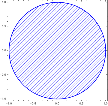
塗りつぶしの代わりにメッシュ
図を色ではなく斜線などの模様で埋めたい時がある。これは色を使いすぎて見づらくなるのを防ぐのに有効。また、色覚異常の人にも優しい。白黒印刷しかしない人にも優しい。やり方は以下。
RegionPlot[ x^2+y^2<1, {x,-1,1}, {y,-1,1}
    ,BoundaryStyle->{Blue,Thick}(* boundary style*)
    ,MeshFunctions->{#1-#2&}
    (* #1-#2 for "////",  #1+#2 for "\\\\", #1 for "||||", and #2 for "===" *)
    ,Mesh->50(* the number of "/" *)
    ,MeshStyle->Lighter[Blue] (*color of "////"*)
    ,PlotStyle->Directive[{Thick,White}](* color between "/" and "/"  *)
]
こうすると以下の図ができる。コマンドの説明はコマンド中のコメントを見よ。
模様で埋めることもできる。例は以下。ただしネットに繋がってないとできないかも。
RegionPlot[x^2+y^2<1, {x,-1,1}, {y,-1,1}
   , BoundaryStyle->{Black,Thick}
   , PlotStyle->Texture[ExampleData[{"ColorTexture","MultiSpiralsPattern"}]]
]
こうすると以下の図ができる。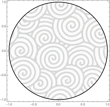
他にどんな模様があるかはヘルプファイルで
ExampleDataを調べて見よ。自前の模様を使いたい場合は Texture の引数に png ファイルでも張り付けよ。多分うまくいく。
FrameTicks
  Plot[ f[x], {x,-1,1}
  , Frame -> True
  , FrameTicks -> {{left, right},{bottom, top}}
  ]
The default value of the FrameTicks is {{All, Automatic}, {All, Automatic}}.
We can explicitly specify ticks like,
left = { {0.01, a}, {0.02, b}, {0.03, c} }
Then ticks appear at y = 0.01, 0.02, and 0.03. They are labeled as a, b, and c, respectively.
The length of the ticks is specified like,
left = { {0.01, a, {0.02, 0}}, {0.02, b, {0.02, 0}}, {0.03, c, {0.02,0}} }
Log plot in Contour Plot
最近はオプションに ScalingFunction->"Log" とすればうまくいく。以下は古い。
Suppose we would like to make a plot like
ContourPlot[ f[x,y], {x,0,10}, {y, 0.01, 100}]
Then, the log-plot for the y-axis is useful.
However, there are no command such as LogContourPlot.
Simple solution to make a log plot is
    ContourPlot[ f[x,10^y], {x,0,10}, {y, -2, 2}
    , FrameLabel->{x, "Log_10 y"}
    ]
This is OK, but the the ticks in the y-axis are shown like -2, -1, 0, 1, 2.
I prefer to show 10^-2, 10^-1, 1, 10, 10^2.
We can do it by specifying the FrameTicks by
left = {{-2, 10^-2}, {-1, 10^-1}, {0, 10^0}, {1, 10^1}, {2, 10^2}};

ContourPlot[ f[x,10^y], {x,0,10}, {y, -2, 2}
, FrameLabel->{x, "Log_10 y"}
, FrameTicks = {{left, Automatic}, {All, Automatic}}
]
This gives us only {0.01, 0.1, 1, 10, 100}.
More ticks is given by
    Table[If[x == 1 || x == 5
    , {Log10[x*10^y], x*10^y, {0.02, 0}}
    , {Log10[x*10^y], "", {0.01, 0}}
    ], {x, 1, 9, 1}, {y, -2, 2}] // N;

    Flatten[%, 1];
    left = Sort[%];
This gives more ticks, and labels like 0.1, 0.5, 1, 5, 10, ...
The old version is shown below.
reference
For the case the linked page is erased, we copy the information there below.
==================================================
You need to do the scaling by hand, using FrameTicks. Here is a simple
example:

f[x_,y_]:=x^2+Log[y]^2

Let us plot this over the range -3< x <3 and Exp[-3]< y < Exp[3] so that we
get a nice circle.

xmin=-3;
xmax=3;
ymin=Exp[-3];
ymax=Exp[3];

Now, we want to use ContourPlot with Log scaling. So

ContourPlot[f[x, 10^z],{x,xmin,xmax},{z,Log[10,ymin],Log[10,ymax]}]

will produce the desired plot, but with ticks labeled using the log
scale. We fix the ticks by using FrameTicks. Here is a function that
produces a table of {linear,log} values:

tickfunction[min_,max_]:=
Flatten[
   N@Table[
     {e+Log[10,d],d 10^e},
     {e,Floor[Log[10,min]],Ceiling[Log[10,max]]},
     {d,1,5,4}
   ],
   1
]

So, the following produces the desired plot:

ContourPlot[f[x,10^z],{x,xmin,xmax},{z,Log[10,ymin],Log[10,ymax]},
    FrameTicks->{Automatic,tickfunction[ymin,ymax]}]

Carl Woll
Wolfram Research
==================================================
The above function gives like {0, 0.5, 1, 5, 10, 50, ...}.
To make it like {0.1, 1, 10, 1000, ...}, use the following.
tickfunction[min_, max_] :=
 Flatten[
  Table[
   {N[e + Log[10, d]],
    If[d == 1, Round[d 10^e], ""], {If[d == 10, 0.018, 0.009], 0}},
   {e, Floor[Log[10, min]], Ceiling[Log[10, max]]},
   {d, 1, 10, 1}
   ],
  1
  ]

tickfunction2[min_, max_] :=
 Flatten[
  N@Table[
    {e + Log[10, d], "", {If[d == 1, 0.018, 0.009], 0}},
    {e, Floor[Log[10, min]], Ceiling[Log[10, max]]},
    {d, 1, 10, 1}
    ],
  1
  ]

ContourPlot[
 f[10^z, y]
 , {z, Log[10, ma0min], Log[10, ma0max]}
 , {y, 0, 3}
 , FrameTicks -> {
     {Automatic, Automatic}
    ,{tickfunction[ma0min, ma0max], tickfunction2[ma0min, ma0max]}
   }
 ]
Round[d 10^e] is used for "10. --> 10".
If you want to show numbers smaller than 1, modify it.
0.018 and 0.009 is the length of the major and minor ticks.
Note that FrameTicks is
FrameTicks -> {{left, right},{top, bottom}}
MaTeX
MaTeX["\\alpha", FontSize -> 24]
など。x_1, x_2, ..., x_j, ... のように添字に変数を入れたい場合は
StringTemplate[][] をつかう。
MaTeX[StringTemplate["\\Delta x_{``}"][j], FontSize -> 24]
ふたつあるなら
MaTeX[StringTemplate["\\Delta x_{``}^{``}"][j,k], FontSize -> 24]
とか。
色をつけたい場合,
SetOptions[MaTeX, "Preamble" -> {"\\usepackage{color}", "\\definecolor{orange}{rgb}{1,0.4,0}"}]

MaTeX["{\\color{red}\\delta m=0.166\\text{ GeV}}"]
red と blue は最初からあるが,orange は無いので最初に定義した。
毎回Magnification->1.2と打つのが嫌なら最初に設定すればよい。ついでに色も設定。
SetOptions[MaTeX
, "Preamble" -> {"\\usepackage{color}"
, "\\definecolor{orange}{rgb}{1,0.4,0}"
, "\\definecolor{magenta}{rgb}{1,0,1}"
}
, Magnification -> 1.2
]
凡例
PlotLegens を使う。例えば
PlotLegends -> "Expressions"
PlotLegends -> {"f(x)", "g(x)"}
PlotLegends -> {"f(x)", "g(x)"}
PlotLegends -> Placed[LineLegend[{"f(x)","g(x)"}, LegendFunction -> Framed, LabelStyle -> {FontSize -> 12}], {Right, Bottom}]
PlotLegends -> Placed[LineLegend[{"f(x)","g(x)"}, LegendFunction -> Framed, LabelStyle -> {FontSize -> 12}], {Scaled[0.75], Scaled[0.3]}]
凡例を四角で囲む場合は LegendFunction->Framedをつかうので,そのためにLineLegendを使用している。
そのまま使うと図の外に凡例が作られる。その場合,図を右クリックしてpdfで保存をすると凡例が出力されないので Export["fig.pdf",%] のようにExport を使う。すると図の外の凡例も出力される。
図が煩雑でない場合には,凡例が図の中に来るように調整するほうがサイズがコンパクトになっていいかもしれない。その場合は上の例のように Placed[..., {Right, Bottom}] などを使って位置を調整する。
図にあとから説明文を追記
グラフはあらかじめ作っておいて plt = Plot[...] などと名前をつけておいたとする。
Show[plt
, Graphics[Text[MaTeX["{\\delta m=0.15\\text{ GeV}}"], {8.67, Log[0.4*10^-23]}]]
 ]
など。最後は座標。対数プロットの場合は Log しておかないとズレる。
回転させたい場合は Inset をつかう。(Inset ではなく Text をつかうと文字が歪む。)
Show[plt
 , Graphics[Inset[Rotate[MaTeX["{\\color{magenta}\\delta m=0.16\\text{ GeV}}"], 60 Degree], {8.87, Log[0.4*10^-23]}]]
 ]
NDSolve の x軸の範囲
NDSolve をつかうと Domain:{{aaa, bbb}} のようなものが画面に表示される。これは aaa < x < bbb の範囲で解きましたという情報である。これを抜き出すには次のように引数を "Domain" とする。
y[x_]:= y/.NDSolve[....]
domain =  y["Domain"][[1]]
xmin=domain[[1]]
xmax=domain[[2]]
リストの操作
Most[{....}] 最後だけ消す.
Rest[{....}] 最初だけ消す.
Differences[{....}] 差分.
Most[{a,b,c,d}]={a,b,c}
Rest[{a,b,c,d}]={b,c,d}
Differences[{x0,x1,x2,x3}]={x1-x0,x2-x1,x3-x2}
積分を台形則で計算するときなどに便利。